← back
Trailforks Redesign
Medium: Digital
Duration: Five weeks
As an app that helps mountain bikers find and track rides, Trailforks required a design that streamlines its pleathora or data and functions in an intuitive interface.
In coordination with the app’s creators, our group aimed to bring simplicity and ease to a much-beloved application.
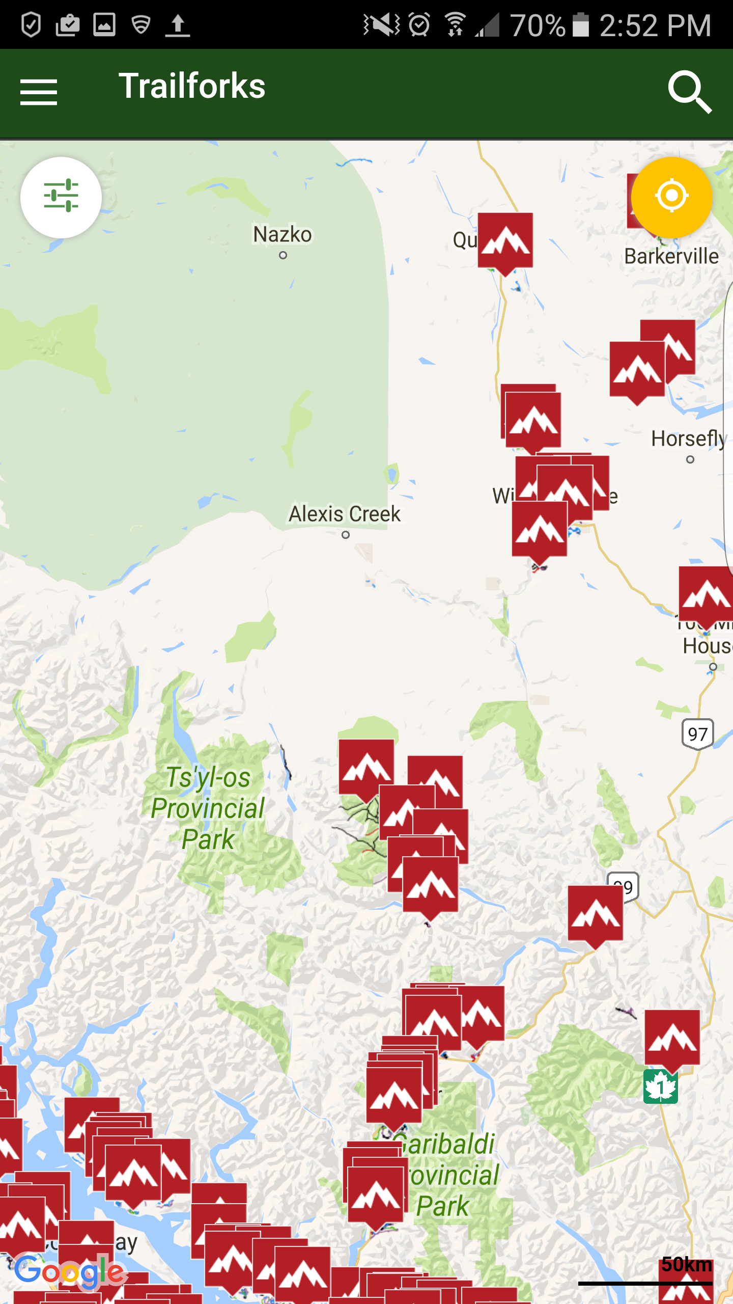
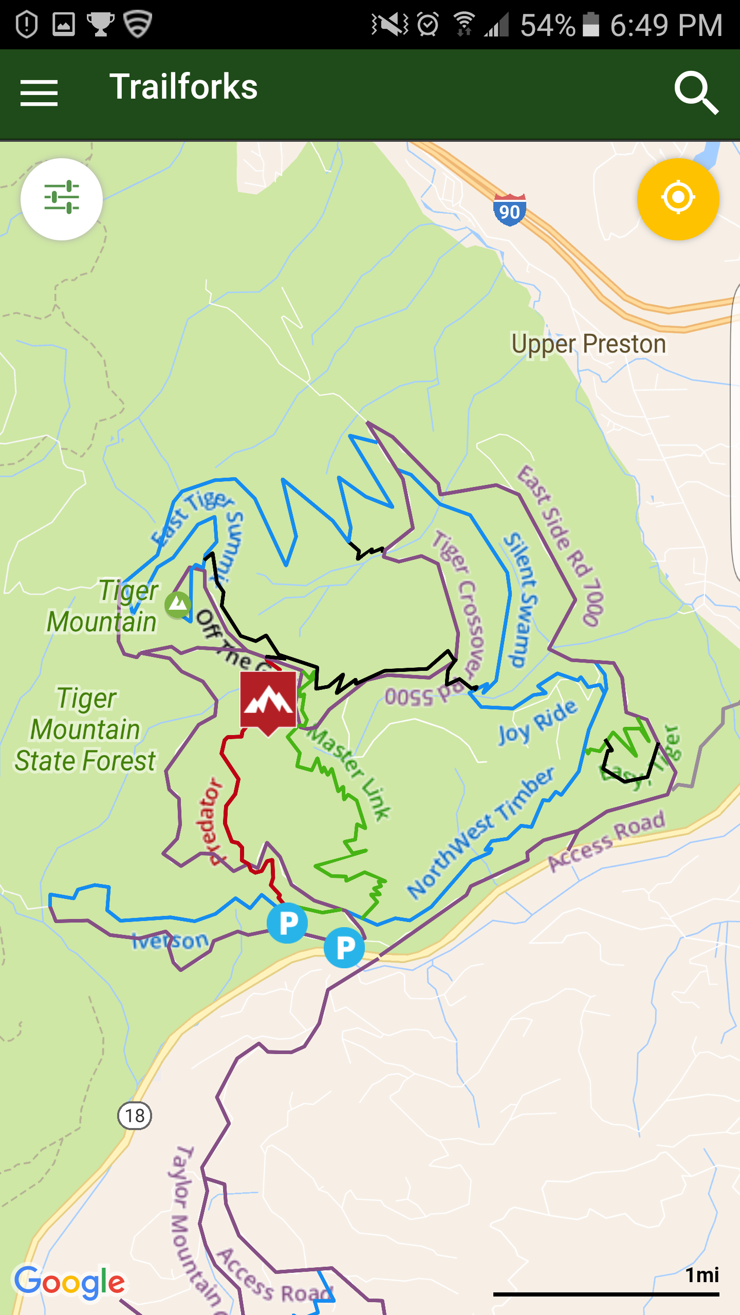
Current Design
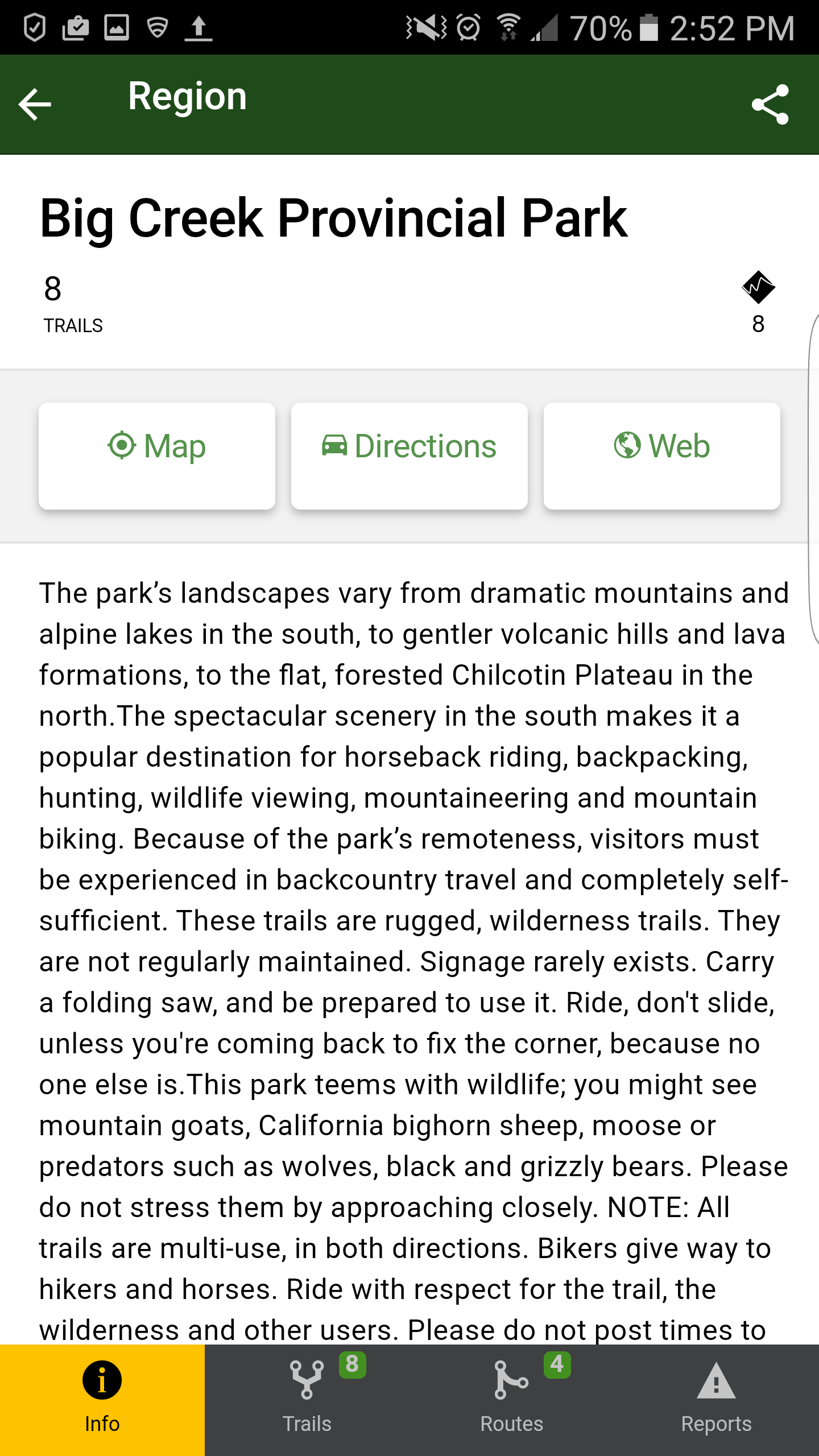

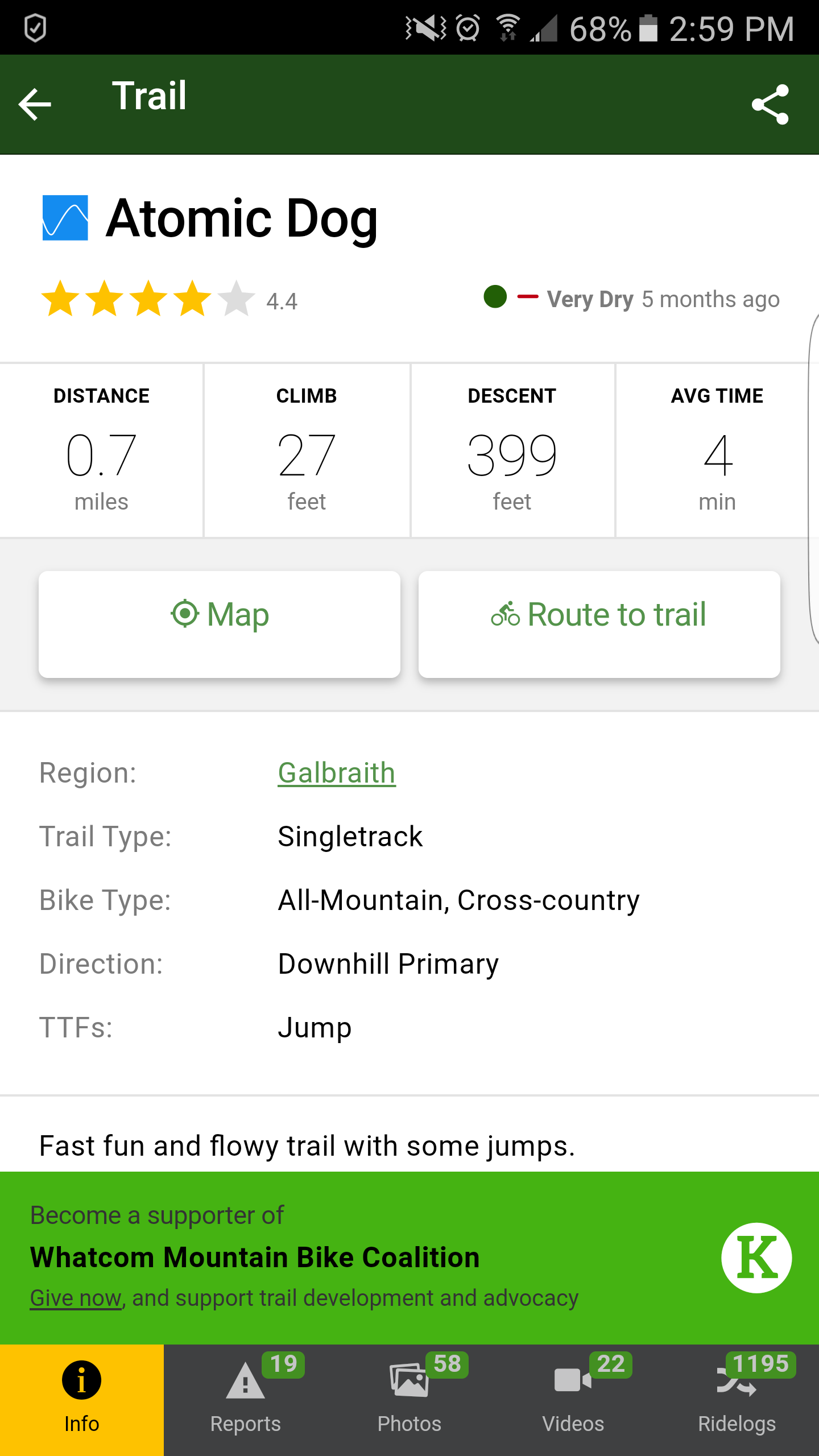
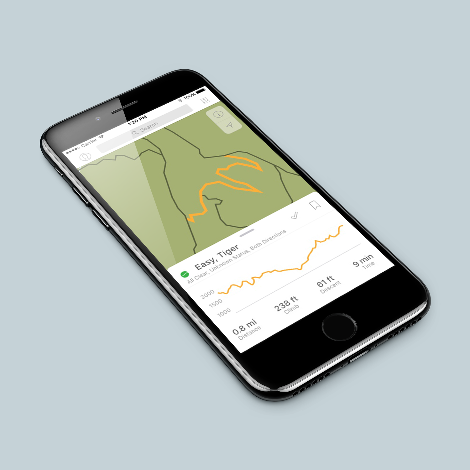
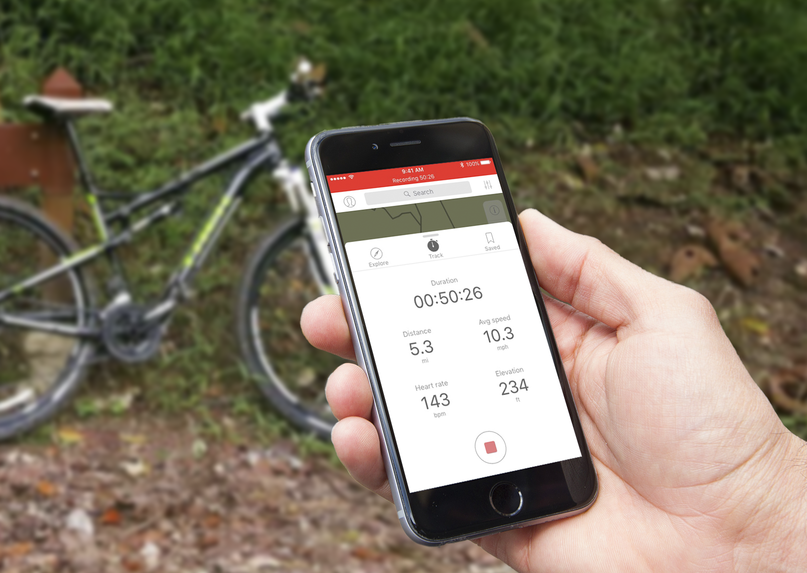
Redesign

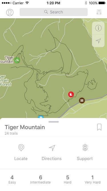
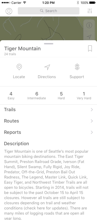
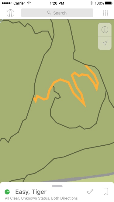
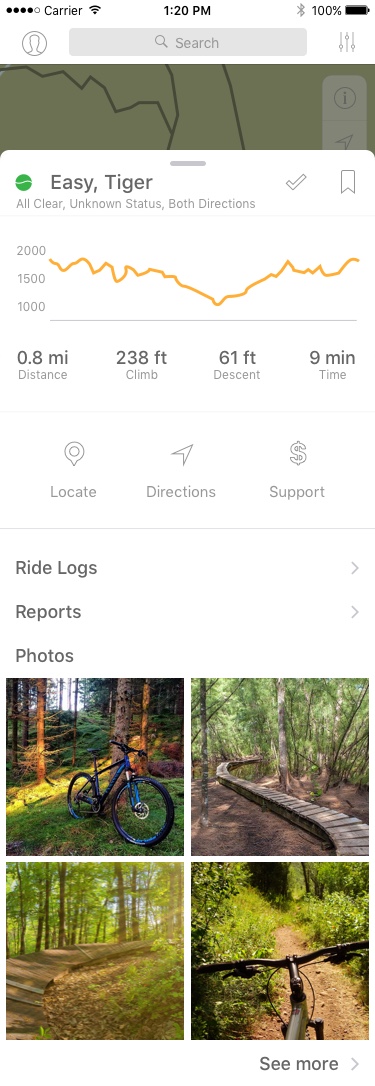
Pain Points
- All navigation is in the hamburger menu creating disconnect between the menu and the map
-
Hamburger menu cluttered
-
Large number or parks and trails shown in one view crowds the page and confuses the eye as to where to look
-
Tab bar only appears in park/trail views while still having navigation in the page above and the hamburger menu
Competing Apps
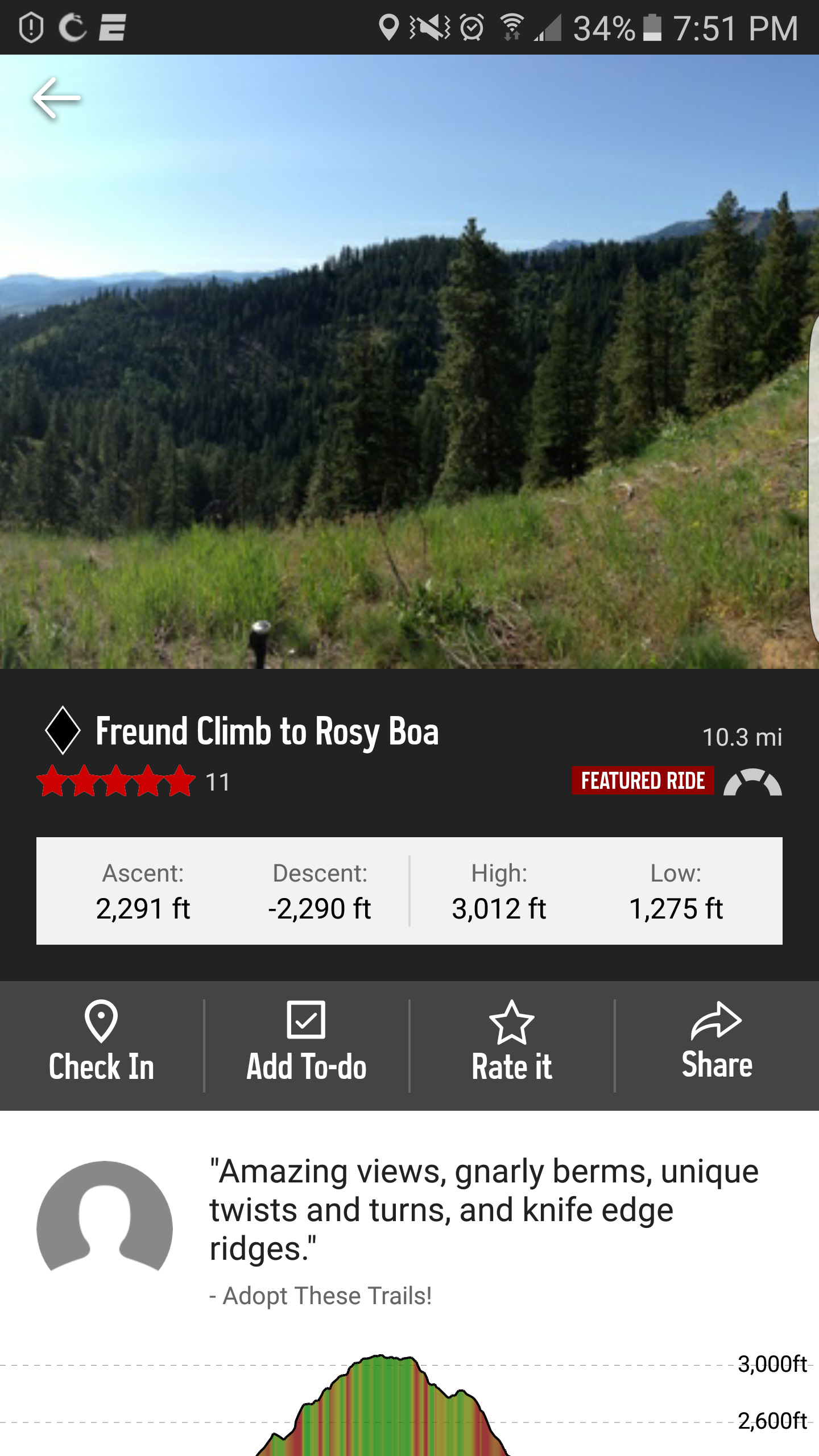
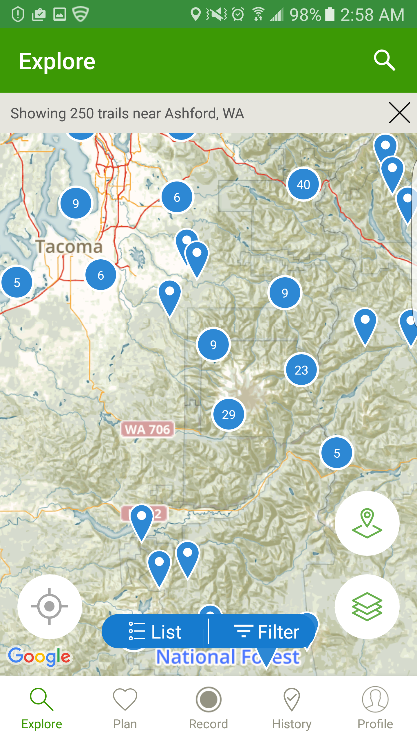
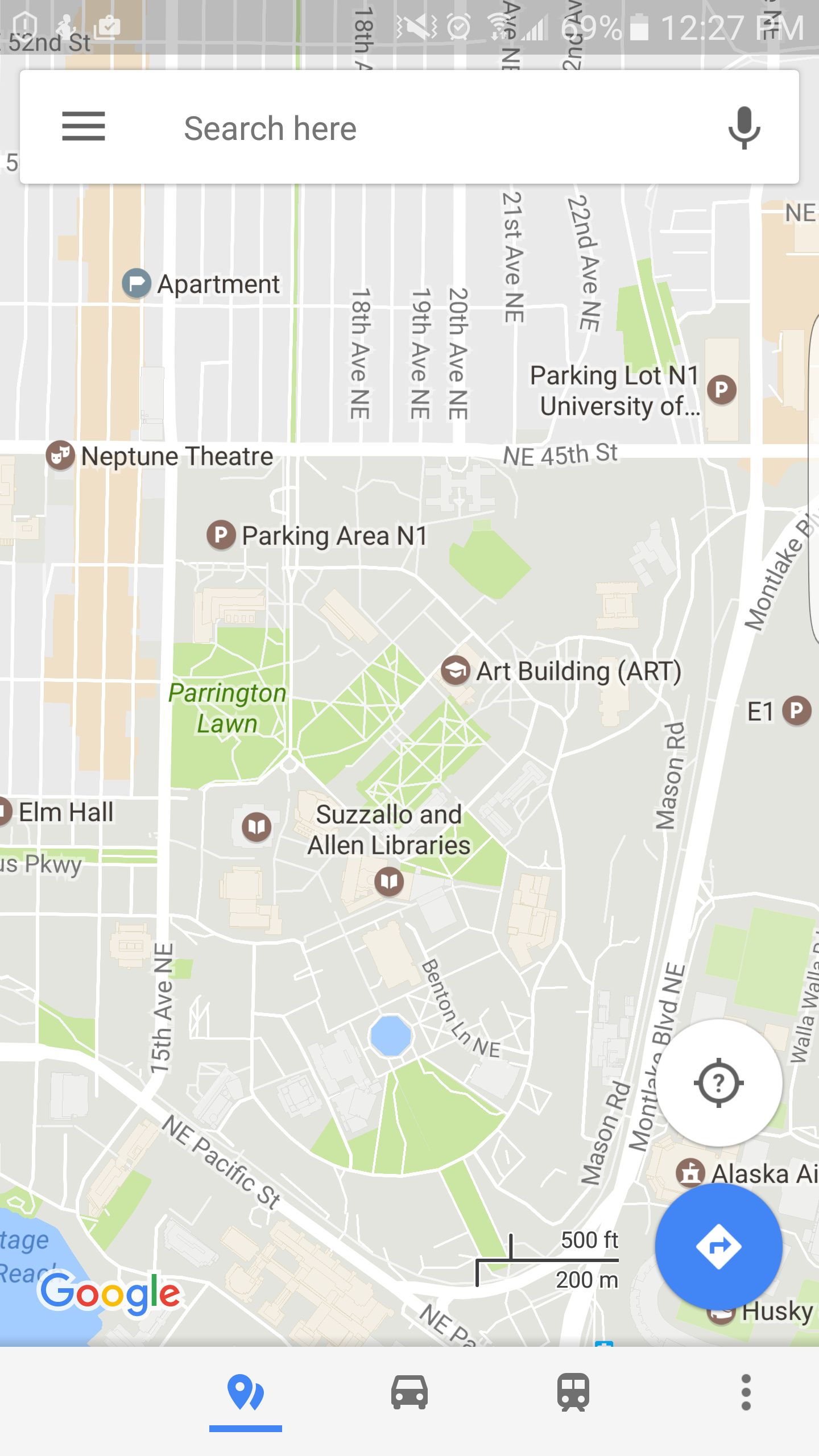

Mountain Bike Project, AllTrails, Google Maps, Yelp
Design Opportunities
- Restructuring of contents in hamburger menu; exploration of other solutions such as a tab menu or other modules users are more familiar with
- Clean up map views especially when multiple trails are being shown
- General cohesion of visual elements
Research
- Inspiration: exercise apps (Mountain Biking Project, AllTrails), map-based apps (Google Maps), and information-heavy apps (Yelp)
- Interview with Trailforks creator about current user base and what changes they would like to see
Redesign based off Trailforks iOS app circa 2016